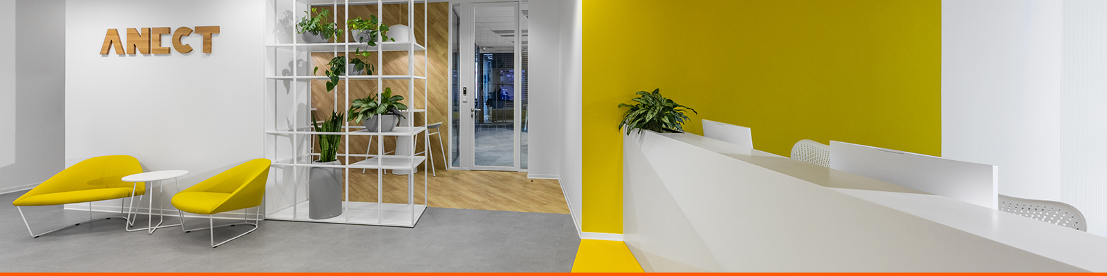
Anect
Innovation – Simplification – Benefits
We are a purely Czech company that has been providing services related to information and communication technology for 30 years.
We have worked hard to become one of the leading providers of managed services in the areas of cybersecurity and enterprise architecture. Across these areas, we offer a comprehensive approach, from mapping your environment and planning a complex strategy to deploying a suitable solution.
We mostly work with enterprise companies, for whom we are a stable long-term partner, but we also provide our services to smaller progressive businesses.
We have our own innovation hub that employees across the entire company participate in and that has been source of projects such as Clashing, a gamified cybersecurity education platform, and XTENDISE, an application that simplifies working with Cisco ISE.
www.anect.comPrimary
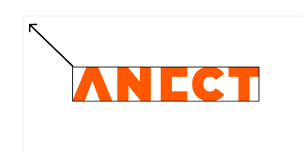
If possible, always use the ANECT logo in the Basic version (in orange color). The inverse version is suitable for colored materials where orange would not be easily legible. Use the black version only if it is not possible to work with colors.
Icon
As with the logo, primarily use the ANECT logo in the Basic version (in orange color). The inverse version is suitable for colored materials where orange would not be easily legible. Use the black version only if it is not possible to work with colors.
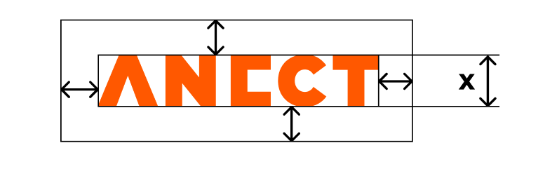
Sizing
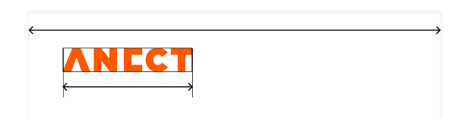
The logo should not be too big, but also not too small. Never use a logo larger than 50% of the width of the material. The normal width of the logo should correspond to approx. 15% of the width of the material. Also respect the minimal size defined bellow.
15 mm / 50 px
5 mm / 20 px
Safe Zone
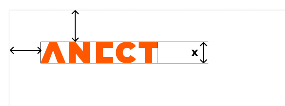
The protection zone of the logo is defined as 2/3 of the height of the logo.
However, use any higher value at your
discretion.
Large-scale logo applications in particular require a larger
protective
zone.
2/3 x
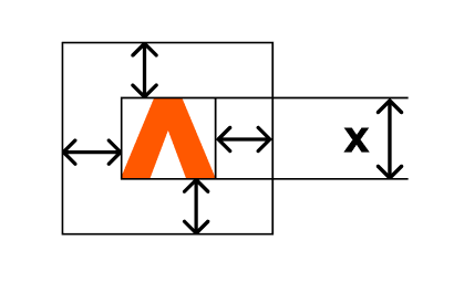
2/3 x
Main Colors
Use primary colors sparingly. Always choose the main color of the visual according to the purpose of the material and choose the representation of colors in the ratio of 60%-30%-10%, where the smallest part is taken up by the accent color and the largest part by the main selected color.
ORANGE
BLACK
GREY
WHITE
Shades of Grey
We primarily use shades of gray to distinguish content. When using, pay attention to the sufficient contrast between the colors of the text and the background.
Accent Colors
These colors are primarily used to further separate content or highlight other elements.
Status Colors
Colors used primarily for Apps or web apps to display the status.
Primary Font
-
Designed by Julieta Ulanovsky, Sol Matas, Juan Pablo del Peral, Jacques Le
Bailly.
Licensed under the Open Font License. -
 Google Fonts
Adobe Fonts
Google Fonts
Adobe Fonts
-
 Fonts in TrueType Font Format
(TTF)
Fonts in TrueType Font Format
(TTF)
-
Fonts in WOFF File Format 2.0
(WOFF2)

Alternative Font
System/App specific Sans-Serif Font
Helvetica, Arial, Segoe UI, Calibri...
Light
Regular
Bold
Basics
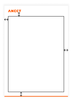
1,5 X (logo height)

Width: 100%, Height: 2 mm / 4 px
Logo Usage
Upper left corner
Recommended max. 30% material width
1.5 X
min. 1,5 X
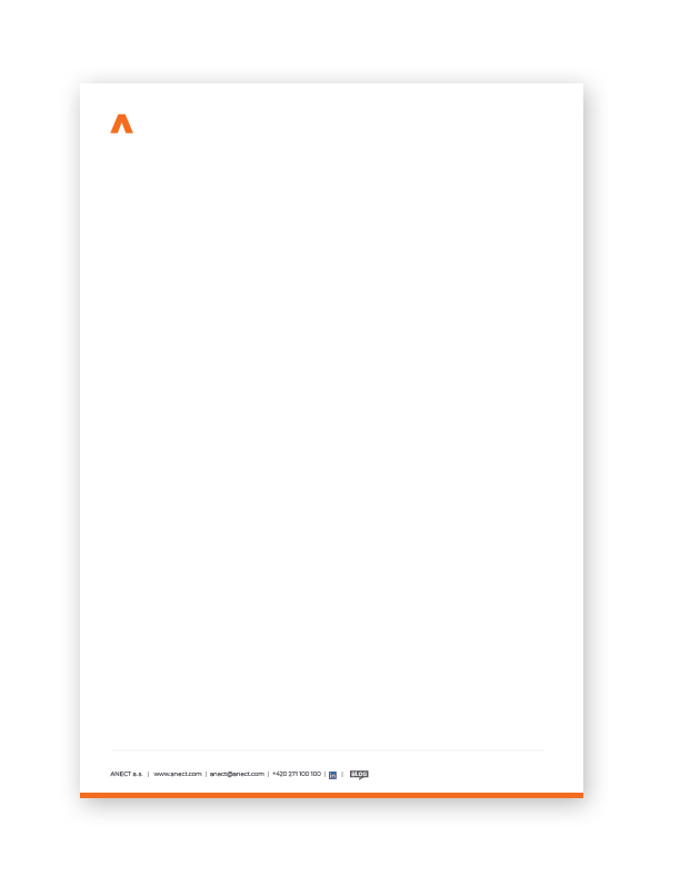
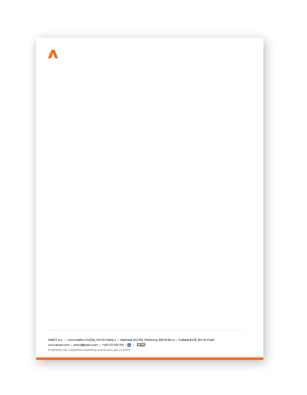
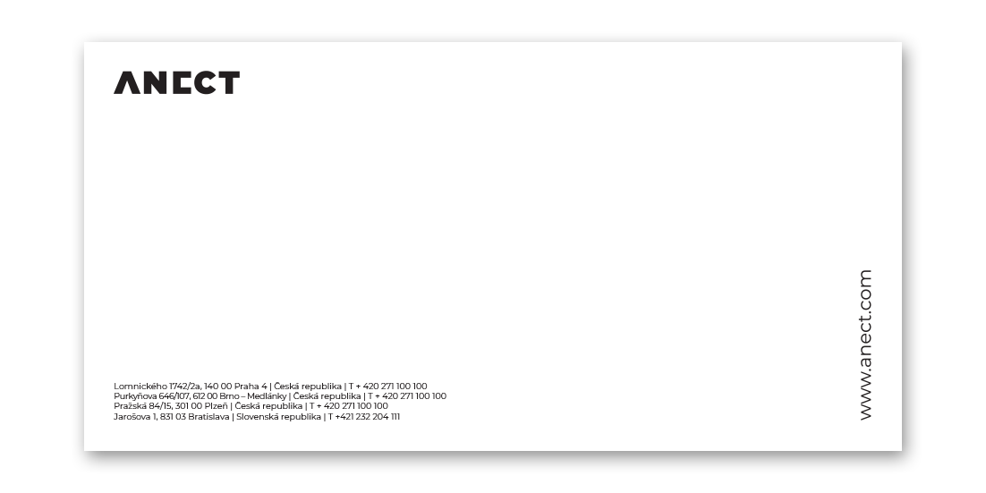
Corporate Letter Paper with Full Logo
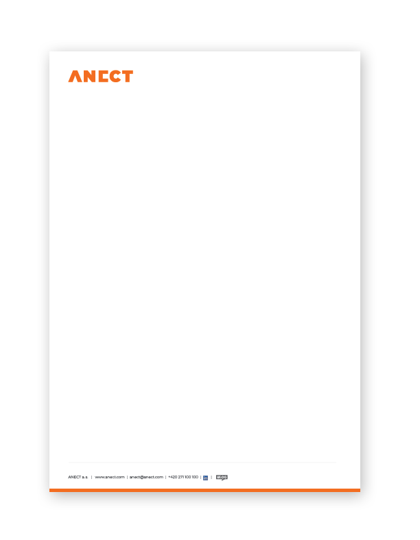
- Letter paper layout follows general rules with max. logo size, position and margins.
-
Adobe PDF
file
-
Adobe InDesign Sources
-
Template in Microsoft Word
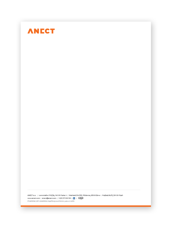
- More complex version of the footer with addresses and key business information.
-
Adobe PDF
file
-
Adobe InDesign Sources
-
Template in Microsoft Word
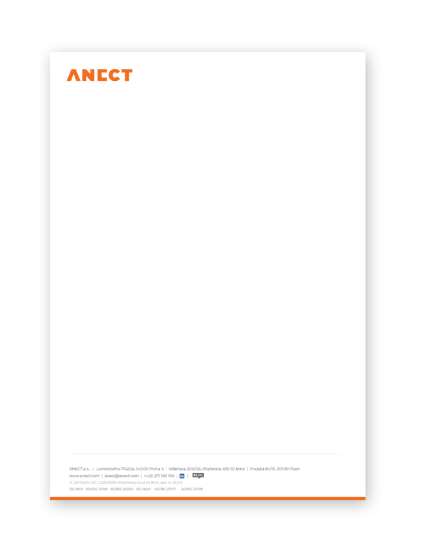
- Full version of the footer with ISO certifications.
-
Adobe PDF
file
-
Adobe InDesign Sources
-
Template in Microsoft Word
Corporate Letter Paper with Logo Icon
- Letter paper layout follows general rules with max. logo size, position and margins.
-
Adobe PDF
file
-
Adobe InDesign Sources
-
Template in Microsoft Word
- More complex version of the footer with addresses and key business information.
-
Adobe PDF
file
-
Adobe InDesign Sources
-
Template in Microsoft Word
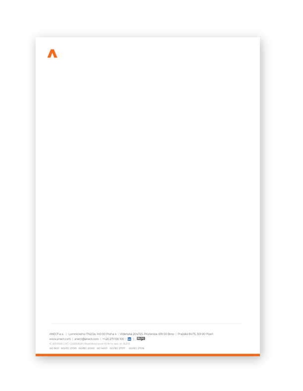
- Full version of the footer with ISO certifications.
-
Adobe PDF
file
-
Adobe InDesign Sources
-
Template in Microsoft Word
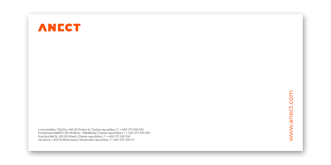
Company Envelopes
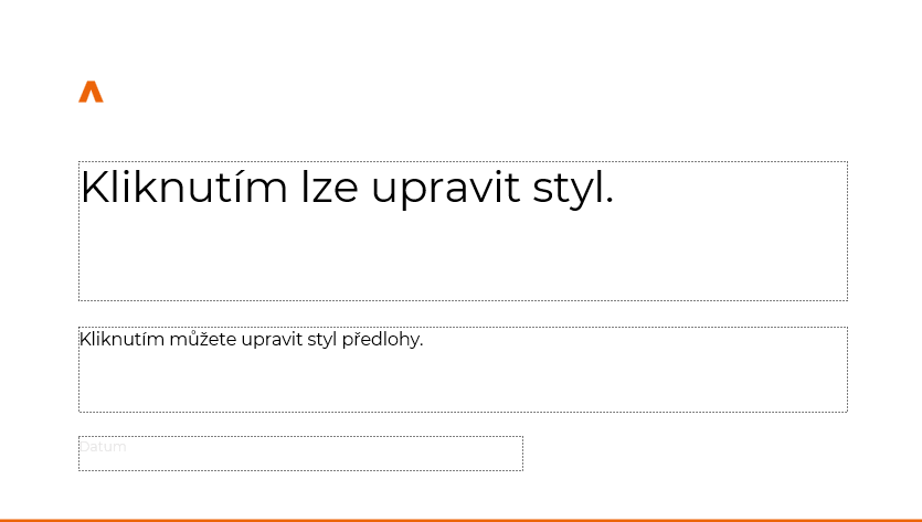
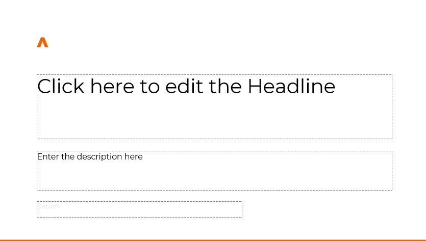
Company Presentation
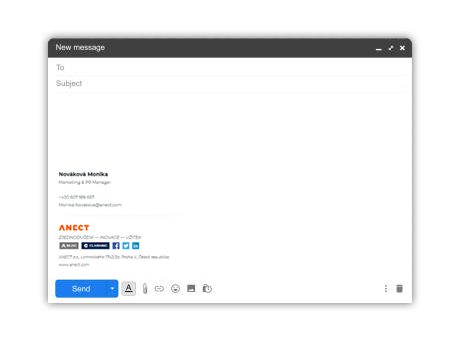
E-mail Signature
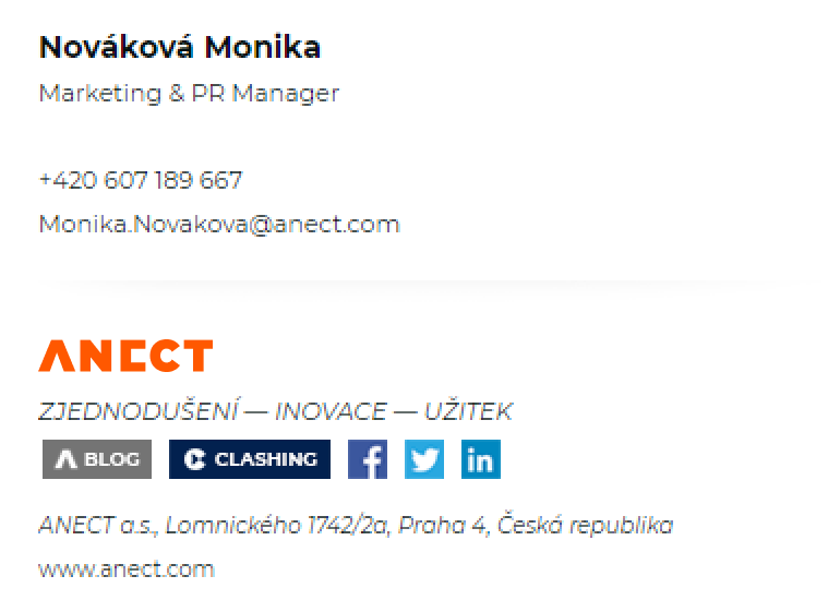
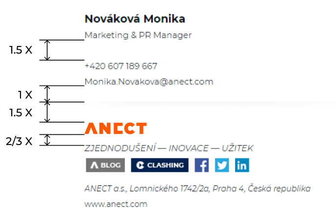
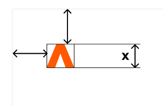
x = logo height
Social Media
- In the social media we use only the Logo Icon with the background in a primary or white colors.
-
Vector
SVG
-
PNG

- In the business related media the preffered version is the white with a primary logo icon.
-
Vector
SVG
-
PNG

- In some cases the logo could be placed on the alternative background - i.e. in case of some special occasions or to support the running campaign.
-
Vector
SVG
-
PNG

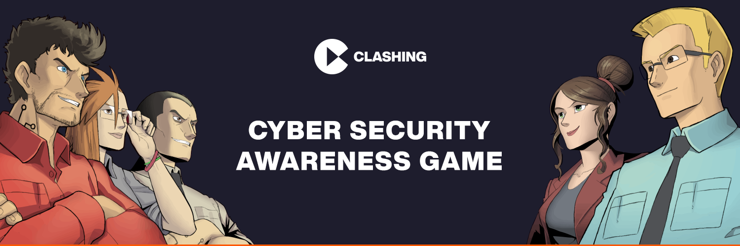
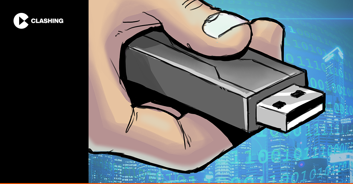
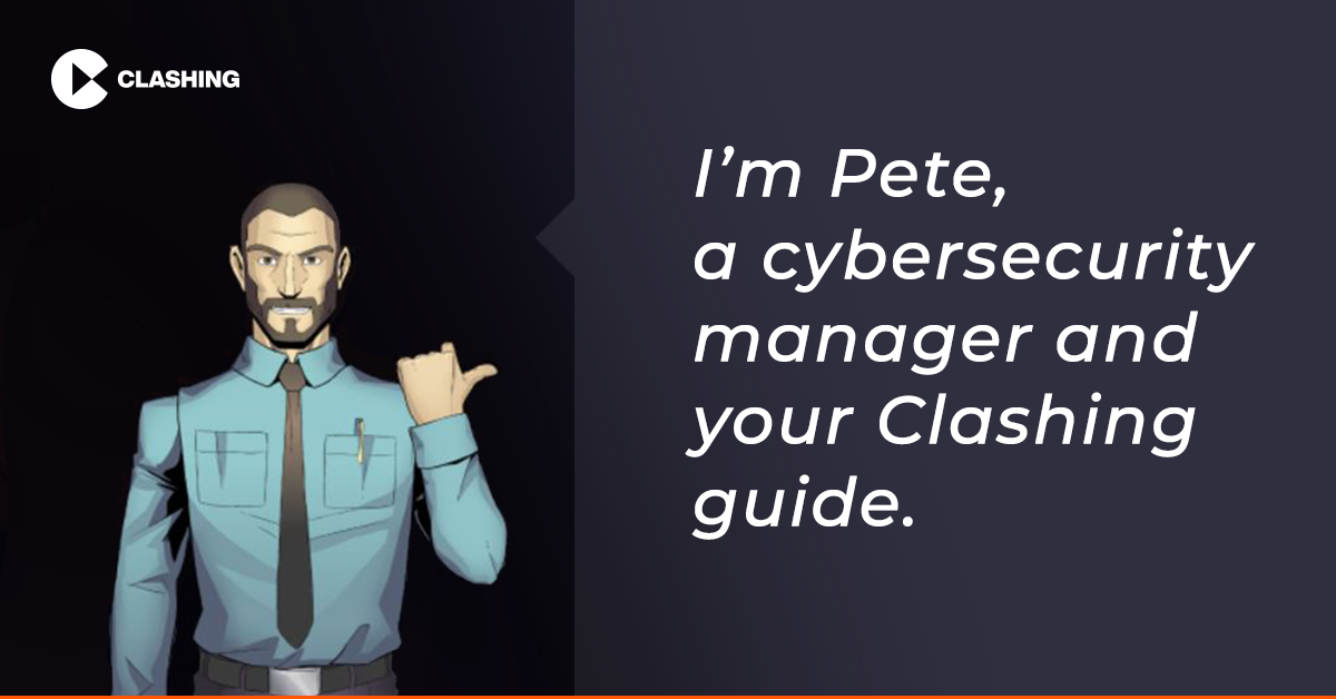
Clashing
Cyber Security Awareness Training
Practice cyber security and more by playing an online training game. Even training can be fun!
www.clashing.comHorizontal


Vertical


Icon


Main Colors
BLUE
Alternative
Primary Font
-
Roboto is a neo-grotesque sans-serif typeface family developed by
Google.
Licensed under the Apache License, Version 2.0. -
Google Fonts
Adobe Fonts
-
Fonts in TrueType Font Format
(TTF)
-
Web Font in Woff2, Woff, EOT,
SVG
and TTF formats
System/App specific Sans-Serif Font
Helvetica, Arial, Segoe UI, Calibri...
Social Media
Presentation

Social Media


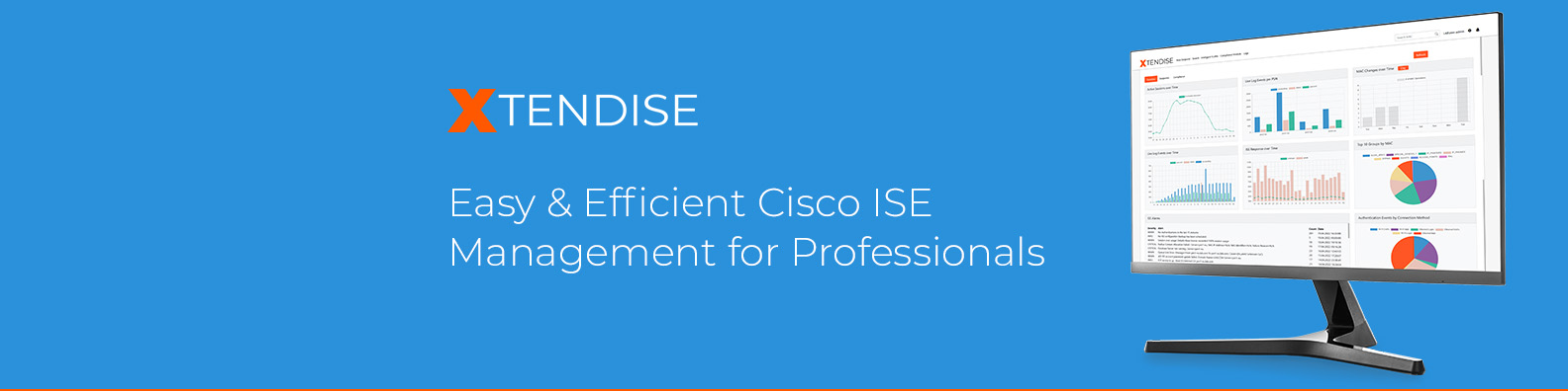
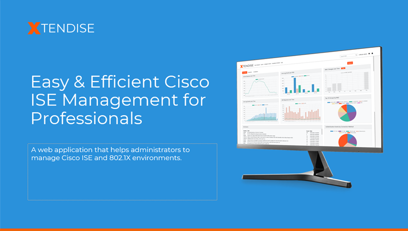
XTENDISE
Easy & Efficient Cisco ISE Management for Professionals
A web application that helps administrators to manage Cisco ISE and 802.1X environments.
www.xtendise.comHorizontal
Icon


Main Colors
ORANGE
Additional Colors
Primary Font
-
Designed by Julieta Ulanovsky, Sol Matas, Juan Pablo del Peral, Jacques
Le
Bailly.
Licensed under the Open Font License. -
Google Fonts
Adobe Fonts
-
Fonts in TrueType Font Format
(TTF)
-
Fonts in WOFF File Format 2.0
(WOFF2)
System/App specific Sans-Serif Font
Helvetica, Arial, Segoe UI, Calibri...
Social Media
Presentation
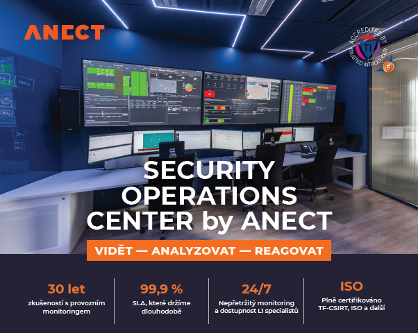
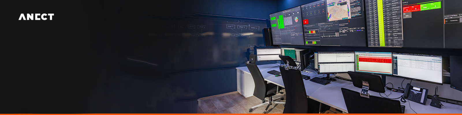
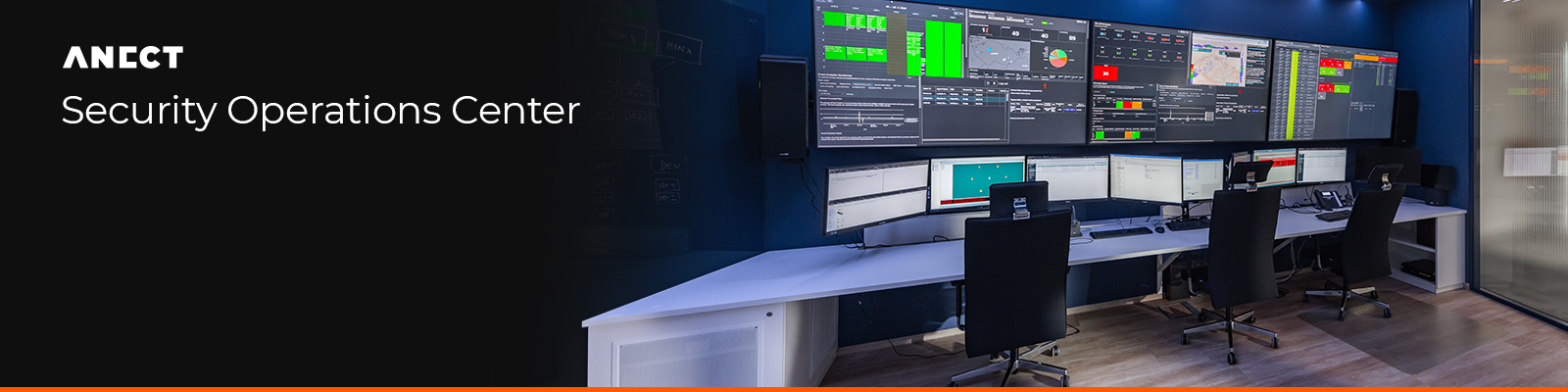
Anect Managed Services
Basic elements


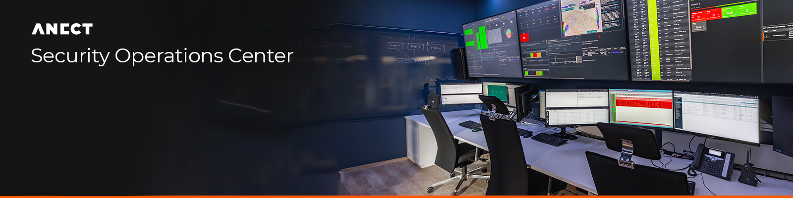
SOC
Basic elements